12/06/06 11:58 PM
Back when I was in college, I wrote a music and entertainment column for the campus newspaper for three of the four years that I was there. At the end of each year, I’d devote a single column to picking out my favorite album artwork, because as a music lover, the artwork and packaging has always played a large role in how I perceive the music that I listen to. Granted, I can enjoy albums that have poor artwork, and on the other hand dislike albums that have amazing artwork, but it always seems a little more special to me when it seems like the artist (or label) put some time and thought into designing the packaging. In this age of trading MP3s and iTunes, it sometimes feels like it’s going to turn into a lost art, but I still have a deep appreciation for some fine album artwork.
I’ve reviewed all of the below albums on my music review site (except the Shedding, which will be upcoming), and the following (ordered from top to bottom) releases may or may not be included in my forthcoming favorite albums of the year list…
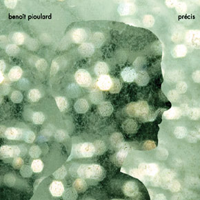
Benoit Pioulard – Precis
Although this was just released in the CD format, there’s something about the cover photography and typography of this album that reminds me of an old LP from the 70s. It reminds me of a dream that I once had where I was following someone at dusk on a hot summer day and I could never quite catch up to them and see who it was…

Tortoise – A Lazarus Taxon
Swiss police officer Arnold Odermatt’s post-accident photographs provide haunting and yet oddly serene (no victims or blood) artwork for this set of Tortoise b-sides. Considering the title of the release (which refers to an organism disappearing from the fossil record, only to re-appear later), the devoid-of-humans artwork is perfect.
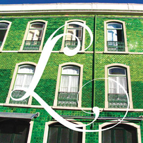
Keith Fullerton Whitman – Lisbon EP
The hyper-saturated cover shots on this EP perfectly capture the feel of a foreign land as seeing it for the first time. Colors seem more vibrant, even smells that may be familar seem somehow more exotic, and sounds (accents, life in general) prick your senses and make you feel a little more alive for having experienced them. This artwork captures that invigorating feeling and makes me want to go overseas again.
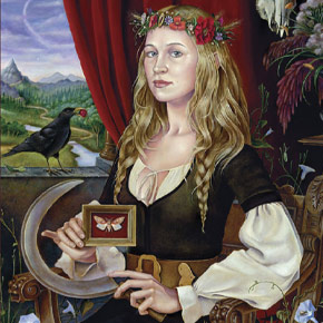
Joanna Newsom – Ys
It’s totally Ren Fest, yet there’s something about this cover that beguiles me a bit. Maybe it’s because I would enjoy having someone paint me to see how it would turn out, but like great portrait paintings, her eyes seem to follow you wherever you go. Combined with a lovely embossed sleeve (that reminds me of a fancy book slipcase), the overall packaging for this one is a gem.
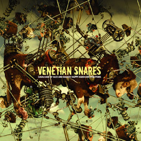
Venetian Snares – Cavalcade Of Glee And Dadaist Happy Hardcore Pom Poms
Ha! And you thought this list was going to be all pretty pictures and fuzzy wuzzies! I can’t quite explain my enjoyment of this cover, other than that it seems to bring out the inner gore-hound in me. It’s one of those insanely-detailed cover art renderings that makes me look closer when seeing it from a distance and then feel weird when I crack a smile after realizing it’s a couple cows getting vivisected by a Rube Goldberg-like device. I’m a vegetarian, but I honestly have nothing against cows.
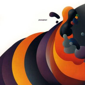
Phonophani – Phonophani
This isn’t even the best work from Kim Hiorthoy (my personal fave of his is probably the Scorch Trio – Luggumt album), but there’s something about this blob of bright gradients that tickles the fillings in my teeth. I remember damn near filling notebooks (I was obsessed with blobs of color) with similary-shaped crayon drawings when I was about 10, and it’s like he read my mind and updated it with a digital touch.
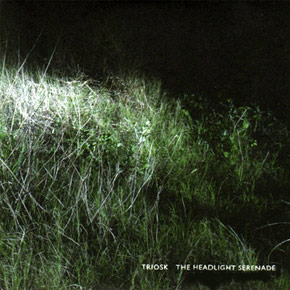
Triosk – The Headlight Serenade
Depending on my mood when I’m looking at it, this cover can take on totally different feelings. The first time I looked at it, it reminded me of being out in the countryside and seeing the grass sway before I turned off the car lights and sat on the hood to look at the stars. Another time I looked at it, it made me think about evil things lurking just out of site. A great, mysterious photo.
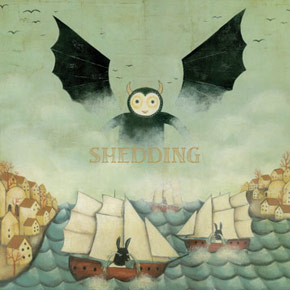
Shedding – What God Doesn’t Bless, You Won’t Love; What You Don’t Love, The Child Won’t Know
A bat-like, but seemingly benevolent creature rises above the mist while schooners with horse / rabbit / dog-like creatures float on a sea of their own tears. Further panels are just as odd and whimsical, and the artwork is just the right amount of light and dark, playful and creepy for this sprawling, found sound ambient release.
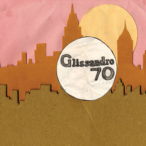
Glissandro 70 – Glissandro 70
A lo-fi, discarded paper and glue reconstruction of the old-school West End disco label sleeve, the light-hearted and ramshackle feel of this sleeve seems to fall in line perfectly with the music contained within.
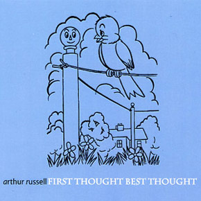
Arthur Russell – First Thought, Best Thought
There’s really nothing mindblowing about this one, but the color combination and simple artwork just really seem to fit the feel of the release. Easily the most “unfinished” batch of work culled from Russell’s archive, the baby blue background and sketchy, line-art feel of the slipcase cover just feel right. They’re also sort of a lighter facade to the more melancholy photos that comprise the artwork within the jewelcase. A nice juxtaposition that is perfectly in line with the music (disc 1 starts out with lighter, almost improv pieces before turning into more droning, expansive work).
(for more album artwork appreciation from 2006, check out Elasticheart’s list)
December 11th, 2006 at 12:05 pm
Wow, that Venetian Snares cover is incredible. Do you happen to know if there is some outlet for buying a poster of it?
December 13th, 2006 at 1:43 pm
I really don’t know of anywhere you’d be able to get a poster of it.
My only possible suggestions (and this is pushing it) are by going through Planet Mu Records, the label that it was released on. Unfortunately their site hasn’t been updated in awhile it seems.
The other option is Arnold Steiner’s (guy who designed it) As 1 Projects design site. Again, though, the site hasn’t been updated with information on that particular album.
January 5th, 2007 at 6:57 am
Some interesting choices here. I do agree with the comment on the Benoit Pioulard album, and it is perhaps emphasised by the cardboard cover.
May 14th, 2007 at 7:02 am
ThanXX for the list. I agree on the quality of the artwork, even if I haven’t heard much of this music (only Triosk and some of Pioulard and Newsom stuff).